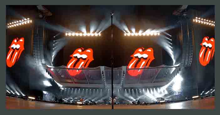
You can spot it a mile away with its cherry red lips and tongue just peeking through the teeth of the logo. 
The head office of the Rolling Stones contacted the Royal College of Art in London to inquire about hiring someone to create a poster for their 1970 European tour. (Americansongwriter)
The school recommended John Pasche, a master’s student. Pasche met with Mick Jagger, offering up some designs, but Jagger wasn’t satisfied. Thankfully, a second version of the poster sealed the deal between Pasche and the Rolling Stones. Pasche created a poster with a ’30s and ’40s aesthetic with a Concorde turbojet.
Later that year, Pasche was contacted again by the Stones. This time by Jo Bergman, the band’s personal assistant. Bergman wanted Pasche “to create a logo or symbol which may be used on note paper, as a program cover and as a cover for the press book.”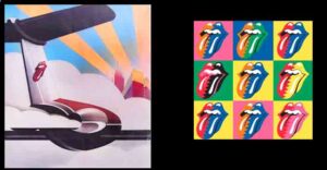
Pasche and Jagger met again to discuss the logo. Pasche recalled that Jagger wanted “an image that could work on its own … like the Shell Petroleum logo. He wanted that kind of simplicity.” In the meeting, Jagger showed Pasche an illustration of the Hindu deity Kali, which Jagger saw at a shop near his home.
Pasche recalled that Jagger was more interested in the Indian cultural side of it as it was trending in Britain. But, Pasche was struck by its protruding tongue from the diety’s mouth. Contrary to belief, the tongue and lips aren’t Jagger’s.
Now, as the Stones tour again, the head of their longtime stage design firm Stufish describes his company’s creations, from 1989’s Steel Wheels gigs to the present day
Of outdoor venues across Europe and Australia. We went through 50 design iterations in order to create a delicate balance between the abstract and the figurative’ (WATCH GALLERY HERE)
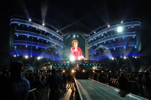
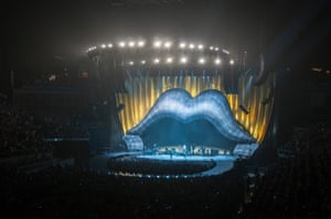
No Filter tour, 2017
‘The No Filter tour was an incredible success. We made a dramatic departure from any other previous Stones show, to create a more modern and clean design, stripped of any superfluous decor; it was our first time adapting a modernist design for the band and a show they had never done before. We were incredibly proud of this tour. Lighting designer Patrick Woodroffe has been instrumental in integrating set and lighting.
You may like also 50 years of Rolling Stones Stage Design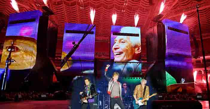
Mick Jagger said there were no plans to mark the Rolling Stones’ 60th anniversary by bringing back former members for guest appearances.
The Rolling Stones are being brought to market by the Crown Mint and get their own coins in silver and gold

Stones fans will need no introduction to the ultra-iconic ‘Tongue & Lips’ logo, first appearing on the album ‘Sticky Fingers’ in 1971, so now celebrating its 50th year. It’s hard to believe these guys are still working together and recently became the first band to top album charts in six different decades.
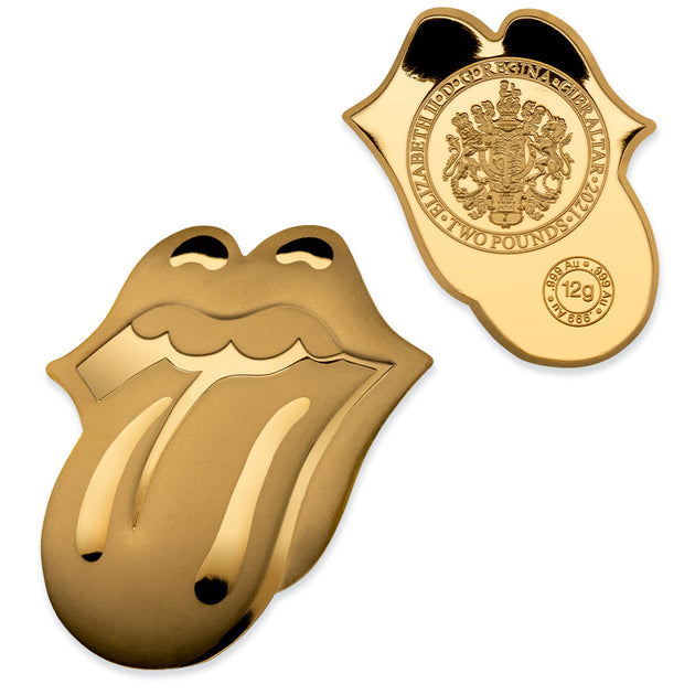
The World's Greatest Rock N' Roll Band—and the coolest band logo in the history of band logos—is now an actual legal-tender coin!
Officially called "Tongue and Lips"—it's the most iconic image in all of rock n' roll—and a calling card of attitude and legend. The iconic logo first appeared in 1971 on the inner sleeve to the classic Rolling Stones' album, Sticky Fingers. When you see it, you know you’re in for riffs, rock and something a little bit risqué.